


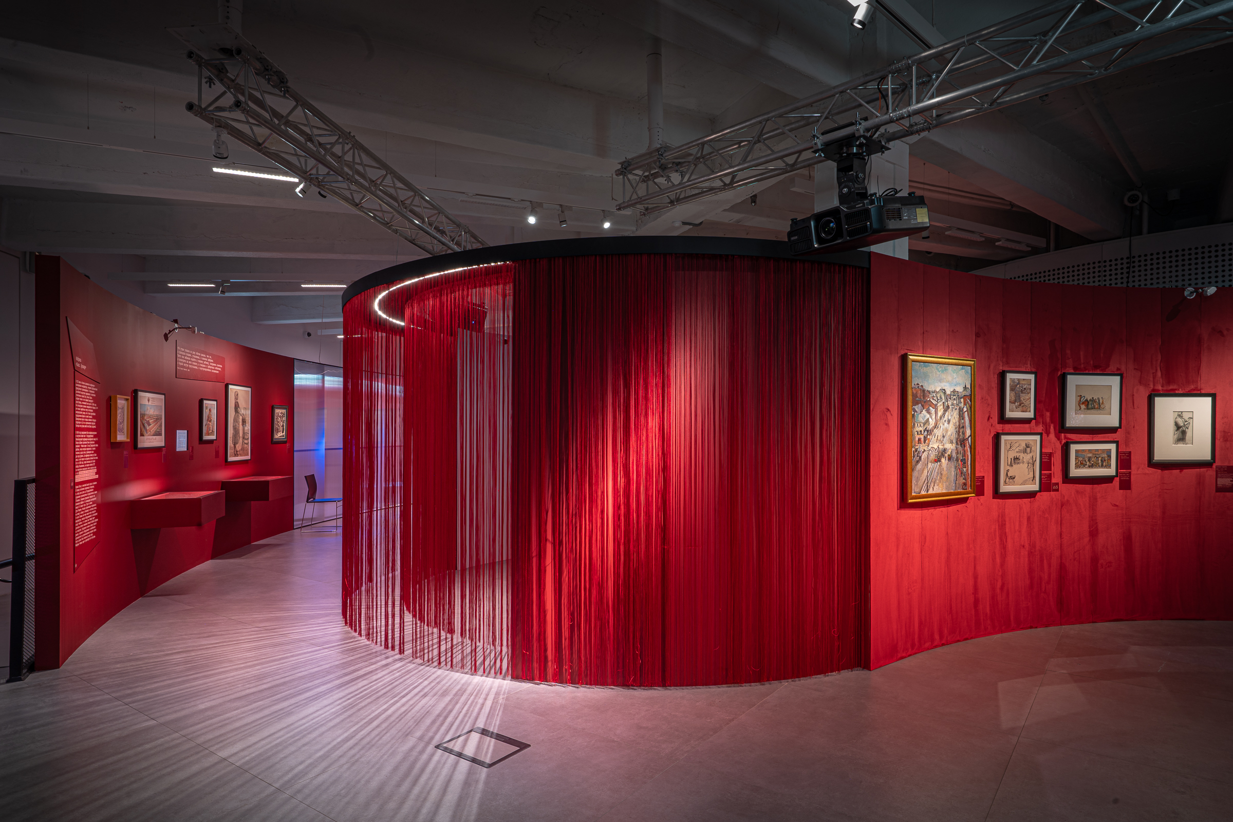

The team designed the project for the first olfactory exhibition at Zotov Centre. The museum’s constructivist building is known for its complicated, cylindrical architecture and circular layouts of the floors with no definitive centre, and a multitude of columns. Smooth lines of architectural forms and light transparent materials – polycarbonate with velvet and pearl muslins, – aided the organisation of such a non-standard space.
The task of the architects was first to convey the spirit of Moscow itself – the city of joy, abundance, beauty and wealth. The city of merchants and colour, changes and opportunities for everyone. As it was more than hundred years ago, Moscow still to this day is associated with youth, dynamism and femininity.
Working on the olfactory exhibition became a special task for the architects due to the ephemeral nature of the exhibits – a vast majority of them were meant to be perceived by viewers using sense other than visual. Requirements such as this one always influence designer’s approach. One of the exhibition’s central concepts – to direct the viewers’ attention towards the scents of the city and how they change depending on the time period, and how each area has one that associates with a specific epoch and place.
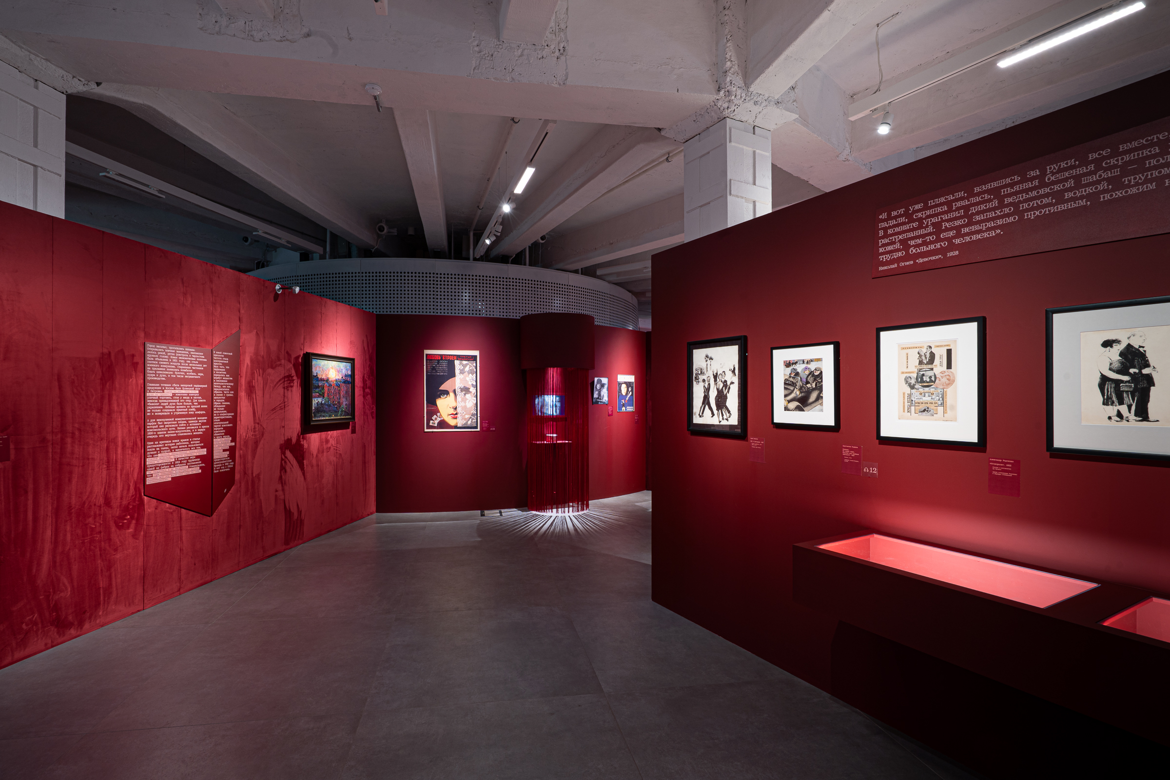
Aside from artworks and vintage cosmetics packaging, installations became the key exhibits at the exposition – the most important being the perfume organ. All the installations were accurately integrated into the narrative map of the exposition to all become independent statement instead of playing the roles of supplementary interactive stations or accompanying elements.
The exposition’s architecture has no sharp angles – one area smoothly pours into the next one. The route decision is intuitive; visitors cannot get lost as they follow the storyline narrated by curators. The colour palette is rather simple and consists of different shades of red. The walls are painted corresponding to the signature colour of the perfume “Krasnaya Moskva”. Red and burgundy extend to muslin and velvet.
By using unexpected materials, the architects significantly diversified the monochromatic palette. The project makes extensive use of polycarbonate, associated with the spirit of progress and industrialisation in the 1920s and 1930s. It adds a particular airiness to the space — perfumes and fragrances are air — and helps to unclutter the space, making it streamlined.
The lighting concept was developed in collaboration with colleagues in the field. The lighting here creates a sense of warmth and intimacy, inherent to traditional femininity, but also transparency, openness, and dynamism. This is why a combination of warm and cool lighting was chosen for the exhibition.
The exhibition architecture represents the quintessence of all things feminine and Moscow. It features smooth, fluid forms and a combination of velvet, muslin, and pearls. At the same time, the exhibition speaks of emancipation, success, and achievement — all of which resonated and was embodied in the design.